Michael Bierut explains the 4 types of logos
I just finished reading this nice article over at Fast Company about designer Michael Bierut. If you don't know his name, you most definitely know his work. His work can be seen all over the world in examples like the United Airlines branding, WalkNYC signage, Disney, and Motorola just to name a few.
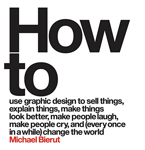
His new book, How to Use Graphic Design to Sell Things, Explain Things, Make Things Look Better, Make People Laugh, Make People Cry, and (Every Once in a While) Change the World, is at the very top of my design book wishlist. It showcases his life's work up until this point and explains some of his thinking in choosing typeface, layout, and color for his iconic logos.
Next week on Tuesday, January 12th at 8:15PM, Michael Bierut will be interviewed by Fern Mallis at the 92Y. Tickets for the event will be $32.
"The Man Who Designed Manhattan" (https://t.co/46j9m2L32Y) @MichaelBierut is here Jan 12: https://t.co/RyrcvTWbTA pic.twitter.com/Kre2qDivBT
— 92nd Street Y (@92Y) January 5, 2016
